Overview
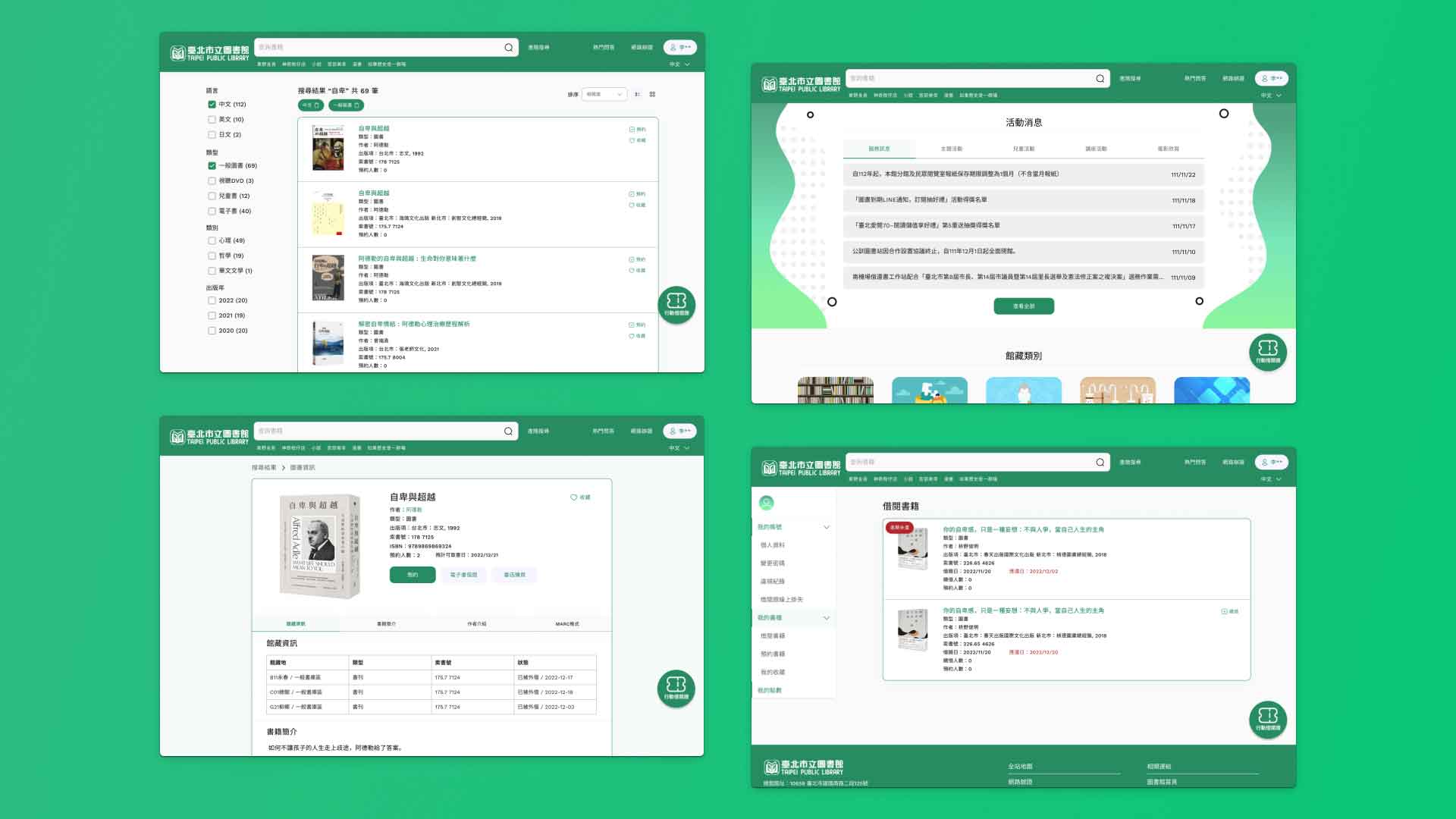
圖書館資訊與館藏網站是不同的網站,而台北市立圖書館館藏網站於2022年12月改版,除了剛上線時發生許多使用者無法登入、無法借書等等問題之外,網站介面仍顯得陽春,因此嘗試重新設計館藏網站。
The library information website and the collection catalog website are separate entities. The collection catalog website of the Taipei Public Library underwent a redesign in December 2022. Apart from encountering numerous issues such as users being unable to log in or borrow books upon its initial launch, the website interface still appeared rudimentary. Therefore, efforts were made to redesign the collection catalog website.
Issue
台北市立圖書館首頁與館藏網站的風格並不一致,也無統一配色。
登入畫面需要下滑才能看到所有資訊,使用者除了無法一目瞭然外,排版也不整齊。
預約到館通知用紅色背景,雖能吸引使用者目光,但警示意味過重,可能讓使用者緊張。
首頁的資訊少,且熱門排行區塊分成「熱門館藏」、「熱門借閱」、「熱門點閱」、「熱門作者」,然而前三項對使用者並無明顯不同,且熱門書籍的預約人數可能多達1000人,熱門系列=排隊系列。
帳號頁面側邊欄命名不清,如:「閱讀紀錄」是借閱中、預約中的書籍;「我的書櫃」是收藏的書籍、薦購清單、新書通報;「歷史紀錄」是借閱、預約歷史紀錄。
書籍資料頁的館藏資訊將「書在館」、「外借數」等等資料隱藏,使用者無法在預設狀態找到自己附近的館藏地的書籍狀態。
The Taipei Public Library homepage and the collection catalog website have inconsistent styles and lack unified color schemes.
The login screen requires scrolling to view all information, resulting in poor user experience and uneven layout.
The red background used for reservation notifications grabs users' attention but may induce unnecessary tension due to its heavy warning connotation.
The homepage contains limited information, and the popular ranking section is divided into "popular collections," "popular borrowings," "popular readings," and "popular authors," with no clear distinction between the first three. Moreover, the number of reservations for popular books can exceed 1000, indicating high demand.
The "popular series" may equate to "queued series." The sidebar labels on the account page are unclear, such as "Reading Records" for books being borrowed or reserved, "My Bookshelf" for saved books, recommended lists, and new book notifications, and "History Records" for borrowing and reservation history.
The collection information on book data pages hides details like "Books in Library" and "Number of Loans," making it challenging for users to locate books and their availability status at nearby libraries by default.
User-Centric Design
以綠色作為主色,讓視覺上符合圖書館相關網站的調性。
修改會讓人混淆的命名,如帳號頁面側邊欄。
館藏分類放首頁讓使用者一目瞭然,並增加首頁豐富度。首頁新增「活動消息」區塊,讓使用者更容易看到圖書館辦的活動。首頁的熱門排行只顯示「熱門排行」與「熱門作者」。
行動借閱證固定於網站右下角,使用行動裝置版時能方便借閱。
預約通知以不擾人的方式呈現,並在首頁顯示借閱數量、逾期未還書等標示。
在書籍資料頁中將館藏資料、書籍介紹資料以 tab 的方式分類,讓館藏資料一次呈現給使用者。
Using green as the main color to visually align with the tone of library-related websites.
Renaming confusing labels, such as those on the sidebar of the account page.
Displaying collection categories on the homepage for easy access and to enrich the homepage's content. Adding a new "Events" section on the homepage to make it easier for users to view library events. Displaying only "Popular Rankings" and "Popular Authors" on the homepage.
Fixing the mobile library card to the bottom right corner of the website for easy access when using the mobile version.
Presenting reservation notifications in a non-intrusive manner, and displaying indicators such as borrowing quantity and overdue status on the homepage.
Categorizing collection information and book introduction data on book data pages using tabs to present collection information to users at once.